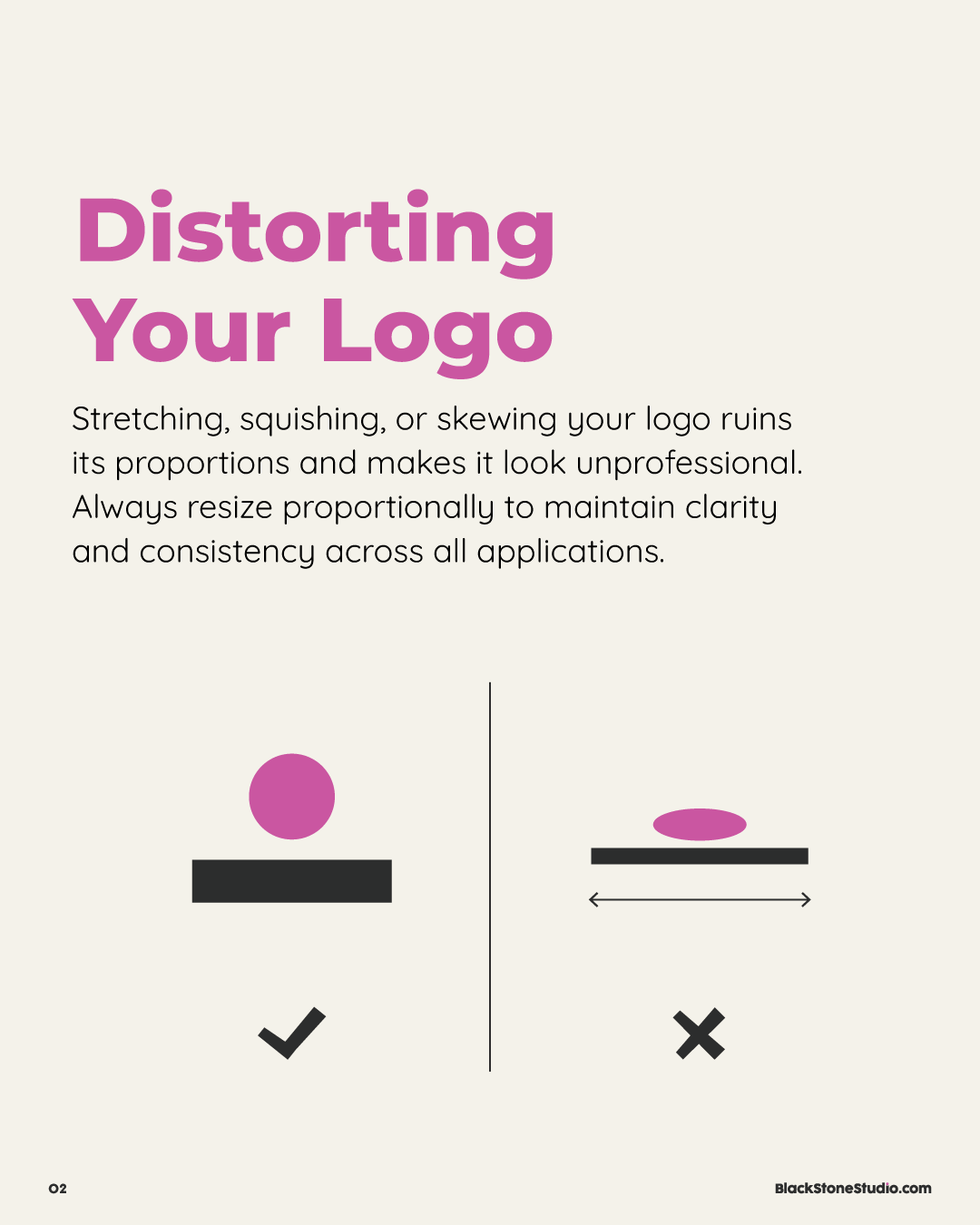
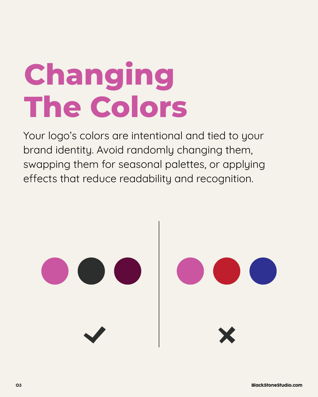
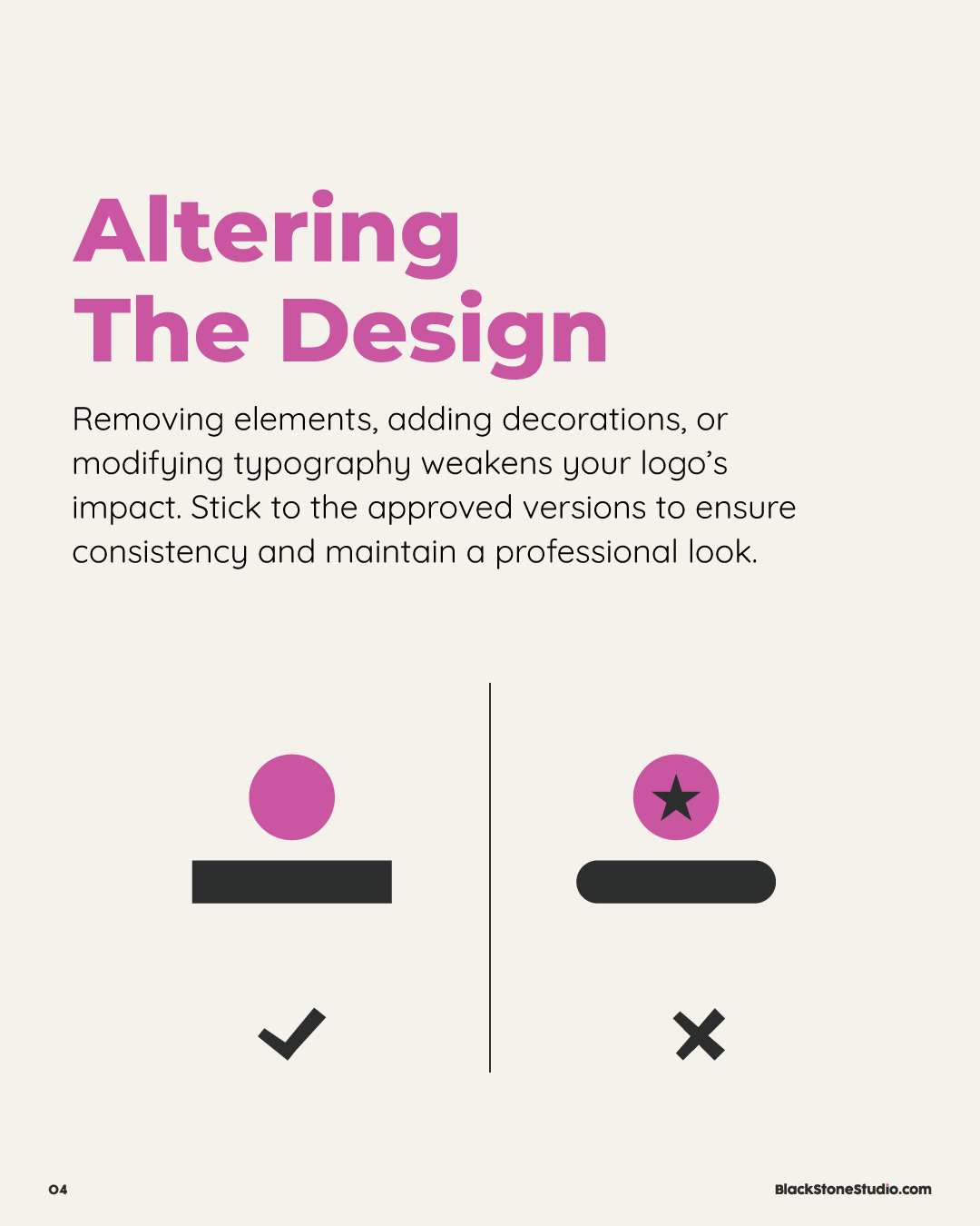
Your logo is a key part of your brand identity, but how you use it matters just as much as the design itself. Certain mistakes can weaken your brand and make your business look unprofessional. From stretching your logo out of proportion and changing its colors or design to misplacing your files, these missteps can create inconsistency and hurt brand recognition. Avoiding these four mistakes will help keep your branding polished, professional, and cohesive across all platforms.